Ascent PEAK Dashboard
OVERVIEW
The goal of this project was to create an interactive and customizable dashboard web application for Ascent’s customers. The application’s focus is for supply management and logistic solutions to aid in our customer’s logistics needs. The application must include features such as live tracking, quoting, bid boards, advanced analytics, order management, billing, trending and routing, vendor management, and many other supply chain functionalities. I worked as the single designer to create this solution.
Ascent Order Entry
ROLE
Lead Product Designer
User Research, Architecture, Visual Design, Prototyping & Testing
November 2020 - Ongoing
The Problem
The Problem
The Problem
Below are screenshots of Ascent’s legacy system before I arrived. These were the initial solutions that Ascent’s customers were using. They were designed by developers and did not include any design thinking. Many of the legacy products comprised of broken architecture, poor navigation, inconsistent design systems, and unnecessarily complex user flows to complete certain actions. There was also an ask to revamp the visuals of the legacy systems and bring the applications up to a modern, sleek design.
Below are screenshots of Ascent’s legacy system before I arrived. These were the initial solutions that Ascent’s customers were using. They were designed by developers and did not include any design thinking. Many of the legacy products comprised of broken architecture, poor navigation, inconsistent design systems, and unnecessarily complex user flows to complete certain actions. There was also an ask to revamp the visuals of the legacy systems and bring the applications up to a modern, sleek design.

Research
Research
Research
GOALS
GOALS
After receiving the design brief, I immediately began talking to our customers. I decided to set up short interviews with a variety of different participants to gain a better understanding of how they used the legacy systems. I wanted to find out what they liked and disliked about their current workflows and which sections needed to be improved. The process was a combination of introducing new features, as well as fixing old ones.
I decided to use Notion to house all of my user research. This became the standard tool moving forward with any future research our team performed with other products.
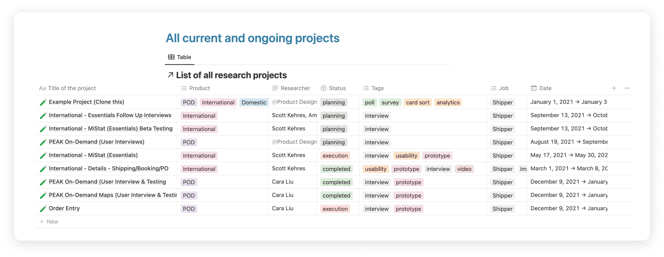
Synthesizing the Data
Synthesizing the Data
Synthesizing the Data
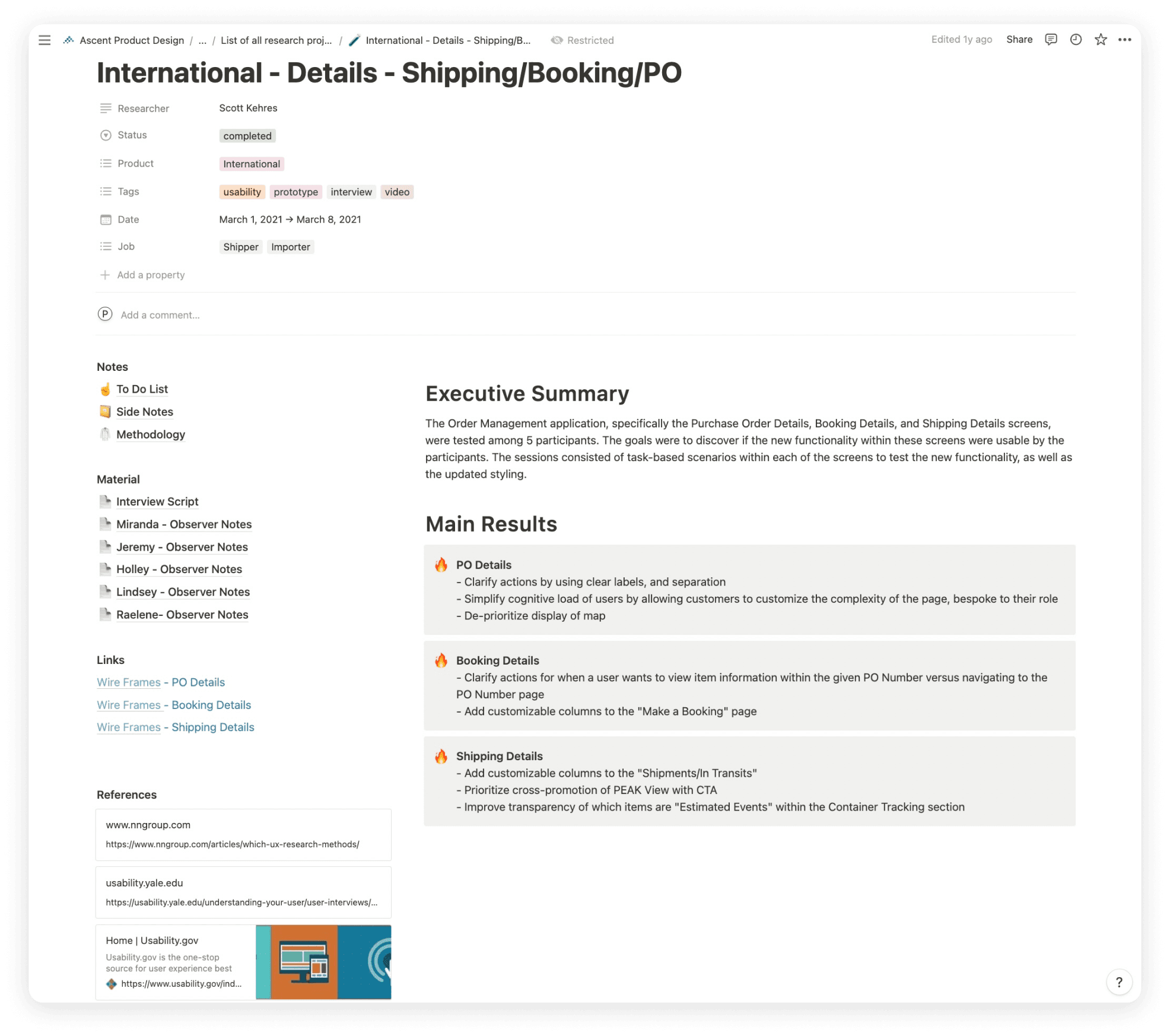
Example from our Notion file that was used to house the research for a specific section of the legacy systems. It included an executive summary, interview scripts and notes, links to the designs, design references, and main takeaways. This document was also accessible to our developers and stakeholders to assign proper takeaways and offer leadership insight into what our customers were saying.
Example from our Notion file that was used to house the research for a specific section of the legacy systems. It included an executive summary, interview scripts and notes, links to the designs, design references, and main takeaways. This document was also accessible to our developers and stakeholders to assign proper takeaways and offer leadership insight into what our customers were saying.
Example from our Notion file that was used to house the research for a specific section of the legacy systems. It included an executive summary, interview scripts and notes, links to the designs, design references, and main takeaways. This document was also accessible to our developers and stakeholders to assign proper takeaways and offer leadership insight into what our customers were saying.
Research Findings
Research Findings
Research Findings
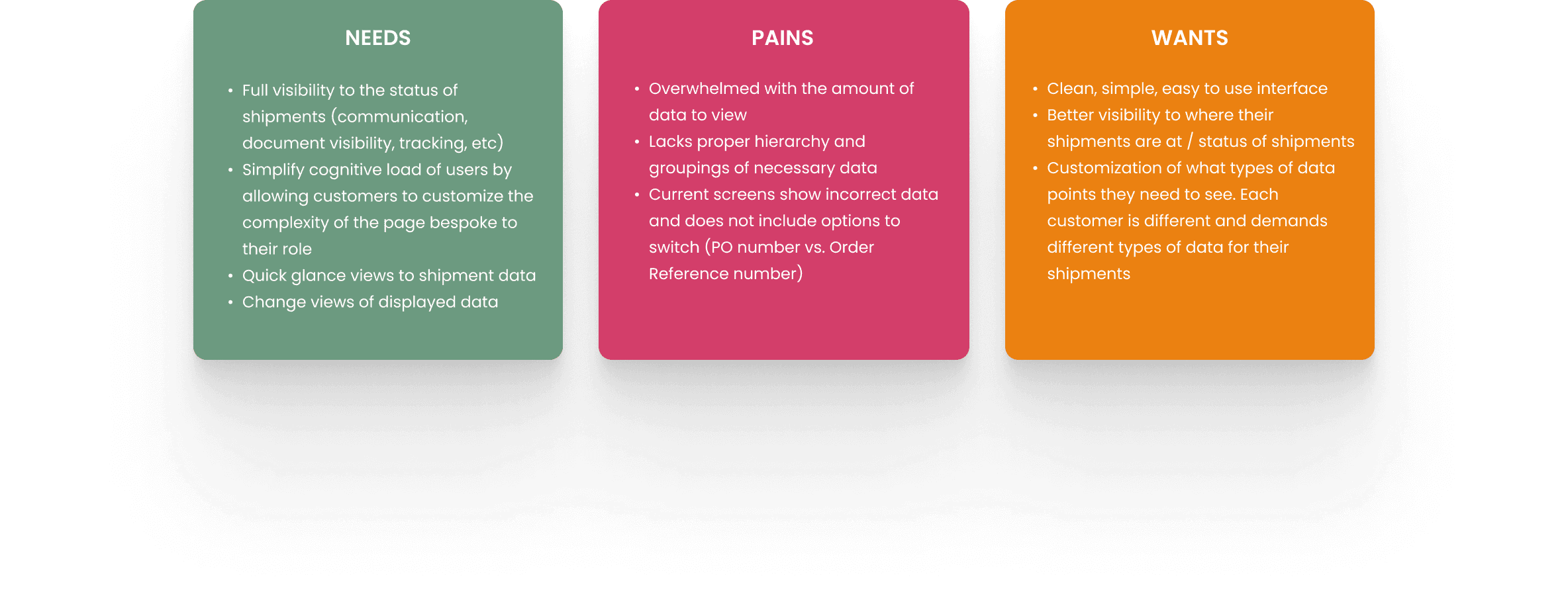
After talking with the participants, user needs, pains, and wants were formed:
After talking with the participants, user needs, pains, and wants were formed:
After talking with the participants, user needs, pains, and wants were formed:
Analyzing the Feedback into Dashboard Widget Solutions
Analyzing the Feedback into Dashboard Widget Solutions
Analyzing the Feedback into Dashboard Widget Solutions
We found that the majority of users needed the following information for their widgets:
We found that the majority of users needed the following information for their widgets:
We found that the majority of users needed the following information for their widgets:
Interactive Map - Show locations of where shipments are located, inbound and outbound groupings, live tracking of where shipments are moving
Shipments by Delivery Address - Show breakdown of shipments based on address locations. Use a proper data visualization to convey this information. Breakdowns should be based on a custom date range inputted by the user
Updates & Holds - Visibility to any late shipments that may occur. Link shipment IDs and show updated ETA times
Ascent Blog - Populate widget with most recent Ascent blog content and articles. Users found this helpful in keeping them in the loop of any supply chain-related updates
Shipment Groups - The most important widget. This widget will organize each incoming shipment while showing their progress, destinations, ETDs, ETAs, order reference numbers, and transportation types. The views should be filterable by a variety of properties such as In Transit, Pre Transit, Delivered, ISF, etc.
Wireframes
Wireframes
Wireframes
Next, it was important to define the interface and information hierarchy at a basic level. This was done first through quick sketches and finally by creating low fidelity wireframes of key pages. This laid the foundation of the widget placement and shipment detail information.
Next, it was important to define the interface and information hierarchy at a basic level. This was done first through quick sketches and finally by creating low fidelity wireframes of key pages. This laid the foundation of the widget placement and shipment detail information.
Next, it was important to define the interface and information hierarchy at a basic level. This was done first through quick sketches and finally by creating low fidelity wireframes of key pages. This laid the foundation of the widget placement and shipment detail information.

Design (PEAK 3.0 Design System)
Design (PEAK 3.0 Design System)
Design (PEAK 3.0 Design System)
The following screens are the first pass of the PEAK dashboard that includes the user feedback. Each widget is fully customizable in terms of its data. This was designed with the legacy PEAK 3.0 design system.
The following screens are the first pass of the PEAK dashboard that includes the user feedback. Each widget is fully customizable in terms of its data. This was designed with the legacy PEAK 3.0 design system.
The following screens are the first pass of the PEAK dashboard that includes the user feedback. Each widget is fully customizable in terms of its data. This was designed with the legacy PEAK 3.0 design system.
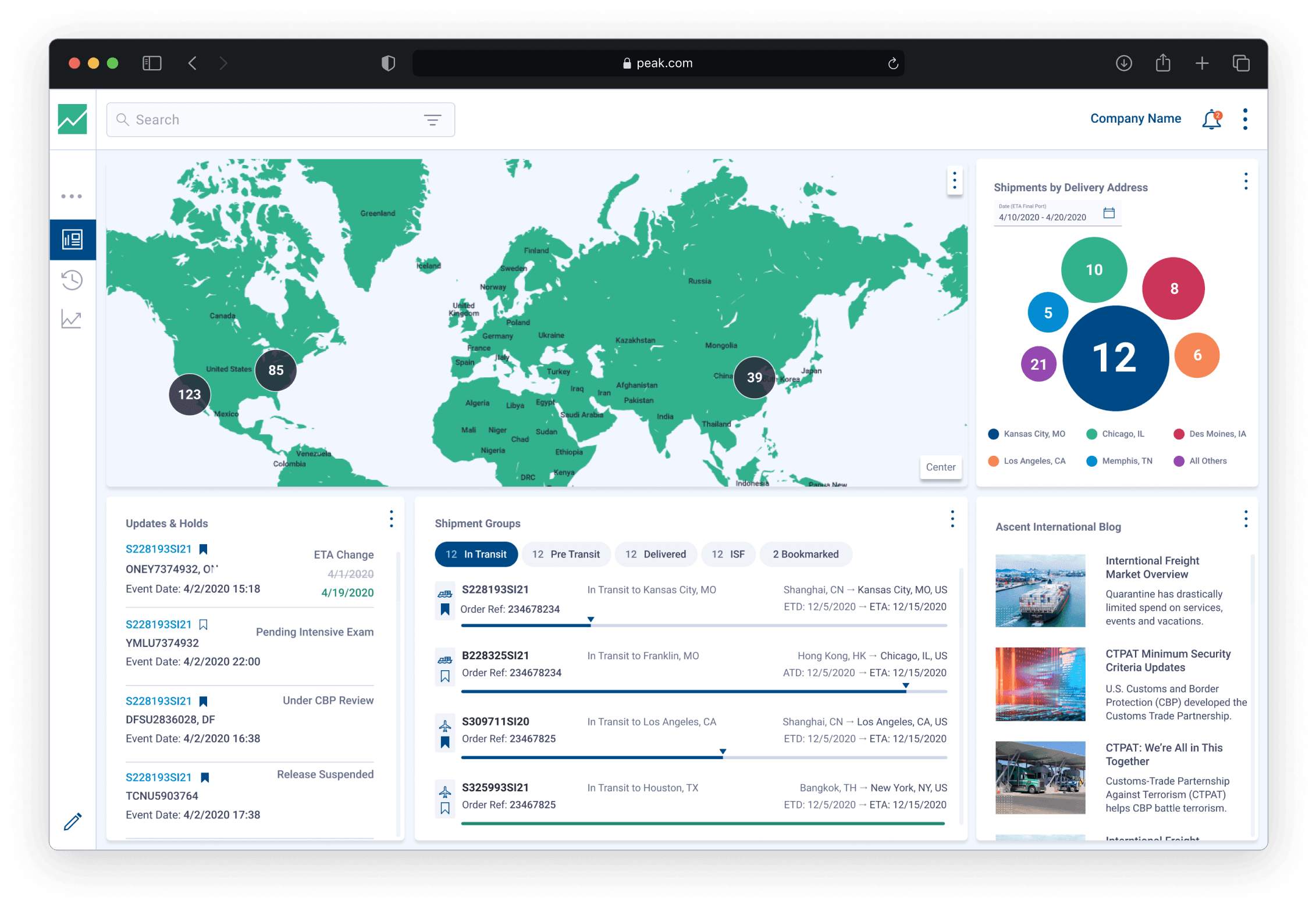
Fully Populated Dashboard
Fully Populated Dashboard
Fully Populated Dashboard
PEAK fully populated dashboard including the 5 previously stated widgets
PEAK fully populated dashboard including the 5 previously stated widgets
PEAK fully populated dashboard including the 5 previously stated widgets
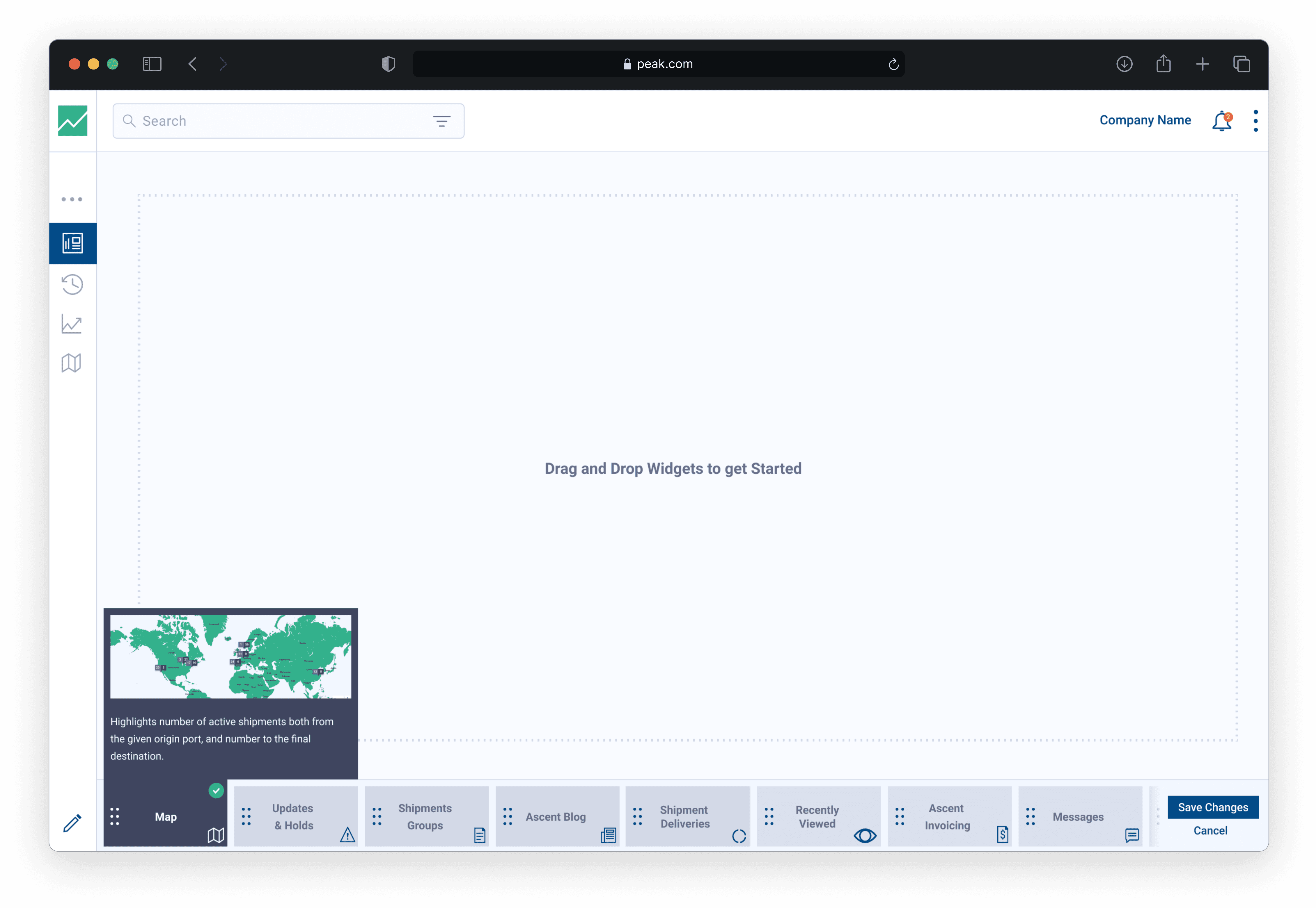
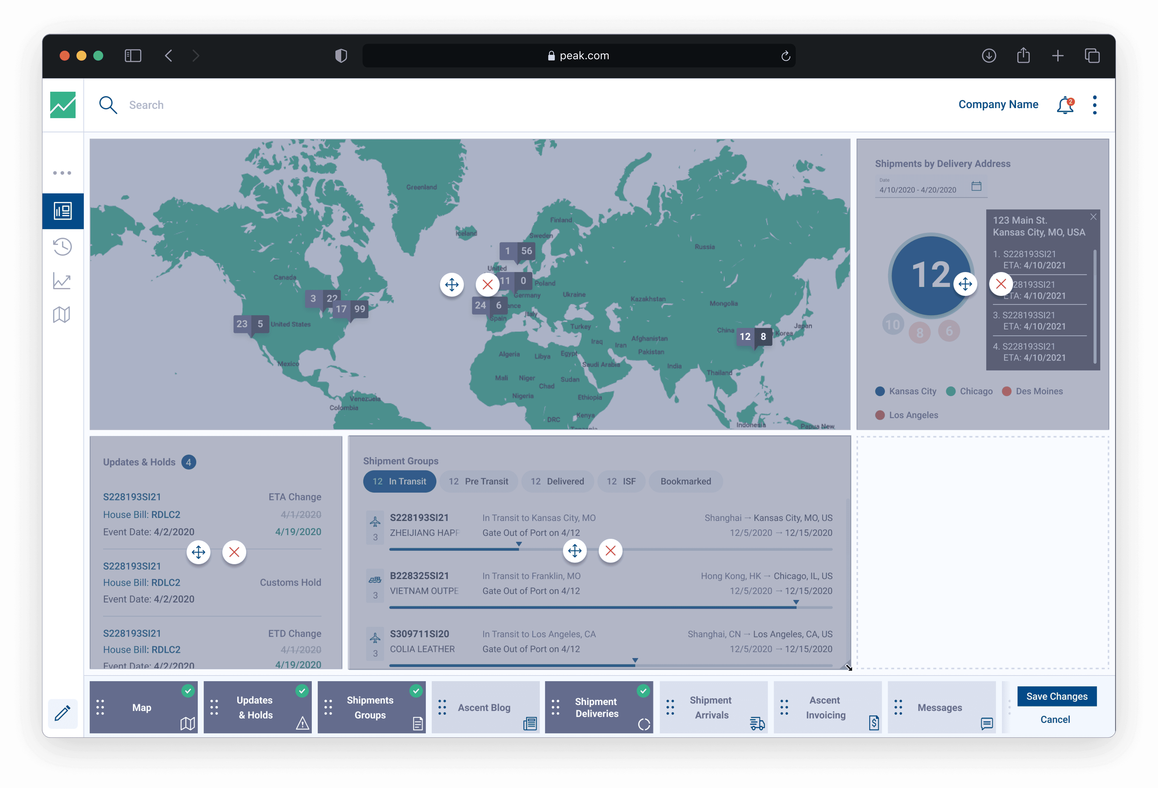
Moving, Resizing & Deleting Widgets
Moving, Resizing & Deleting Widgets
Moving, Resizing & Deleting Widgets
Each widget can be resized, moved, or deleted. We built this framework using the jQuery plugin, Gridster
Each widget can be resized, moved, or deleted. We built this framework using the jQuery plugin, Gridster
Each widget can be resized, moved, or deleted. We built this framework using the jQuery plugin, Gridster
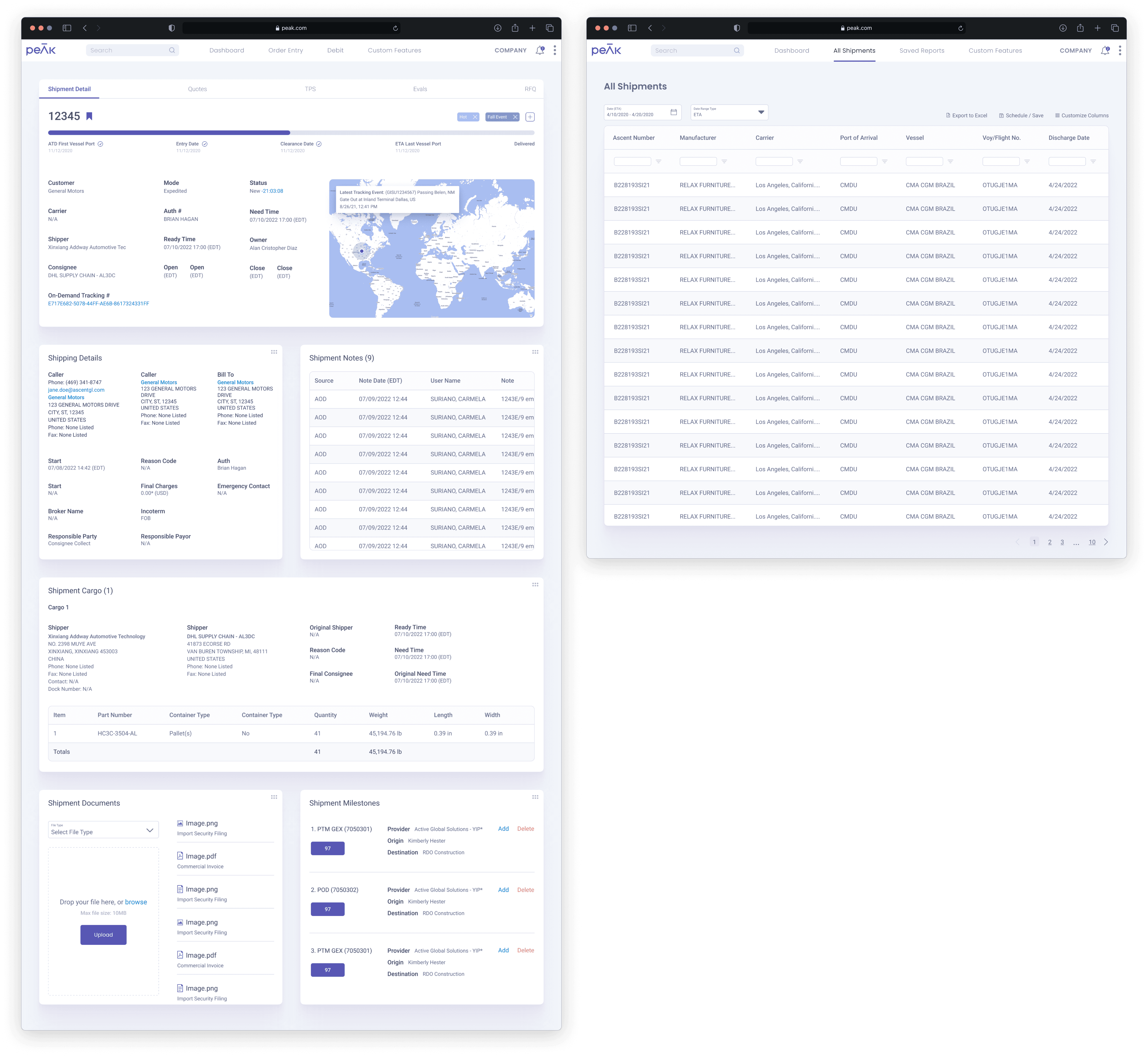
Shipment Details
Shipment Details
Shipment Details
Example of a Shipment Detail page, which houses all of the unique data and tracking for an individual shipment. Each of the main data points are housed in expansion panels including the main shipment details, commercial invoices, container information, container tracking, communication services, and a spot to host documents and images.
Example of a Shipment Detail page, which houses all of the unique data and tracking for an individual shipment. Each of the main data points are housed in expansion panels including the main shipment details, commercial invoices, container information, container tracking, communication services, and a spot to host documents and images.
Example of a Shipment Detail page, which houses all of the unique data and tracking for an individual shipment. Each of the main data points are housed in expansion panels including the main shipment details, commercial invoices, container information, container tracking, communication services, and a spot to host documents and images.

Taking the PEAK Applications to the Modern Level
Taking the PEAK Applications to the Modern Level
Taking the PEAK Applications to the Modern Level
After the MVP launched, there was an ask from leadership to update our design system. Initially when I first arrived at the company, they were not using any custom design system. They were using the components available from Material Design. The ask from leadership was to enhance and elevate the current design system to a more modern and sleek design. The goal was to revamp the visuals in order to attract new customers.
Once the basic application launched, there was an ask from leadership to update our design system. Initially when I first arrived at the company, they were not using any custom design system. They were using the components available from Material Design. The ask from leadership was to enhance and elevate the current design system to a more modern and sleek design. The goal was to revamp the visuals in order to attract new customers.
The main challenge with this task was to push the visuals to an eye-catching design while still maintaining functionality and accessibility.
Read more about my design system process.

Design (PEAK 4.0)
Design (PEAK 4.0)
Design (PEAK 4.0)
Once I finished creating and testing the new design system, as well as receiving approval after presenting the new concepts to leadership and our customers, it was time to implement the new system and reskin the PEAK 3.0 screens.
Once I finished creating and testing the new design system, as well as receiving approval after presenting the new concepts to leadership and our customers, it was time to implement the new system and reskin the PEAK 3.0 screens.
Once I finished creating and testing the new design system, as well as receiving approval after presenting the new concepts to leadership and our customers, it was time to implement the new system and reskin the PEAK 3.0 screens.
Dashboard - Shipment Groups & Map
Dashboard - Shipment Groups & Map
Dashboard - Shipment Groups & Map
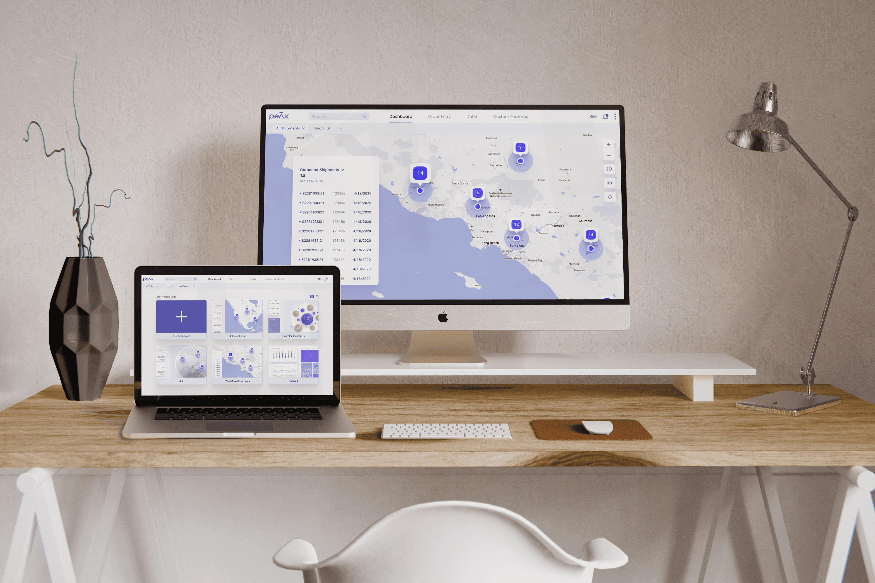
Refreshed dashboard using the PEAK 4.0 design system. This view contains the new Shipment Groups widget on the left and the new map widget on the right. I wanted to introduce 3D elements to the design system with a fully interactive, spinning globe model. The globe can be toggled between a 2D and 3D view. This view also displays the open widget drawer.
Refreshed dashboard using the PEAK 4.0 design system. This view contains the new Shipment Groups widget on the left and the new map widget on the right. I wanted to introduce 3D elements to the design system with a fully interactive, spinning globe model. The globe can be toggled between a 2D and 3D view. This view also displays the open widget drawer.
Refreshed dashboard using the PEAK 4.0 design system. This view contains the new Shipment Groups widget on the left and the new map widget on the right. I wanted to introduce 3D elements to the design system with a fully interactive, spinning globe model. The globe can be toggled between a 2D and 3D view. This view also displays the open widget drawer.

Full Map View (2D)
Full Map View (2D)
Full Map View (2D)
The user has the ability to extend the widgets to a full screen view for better visibility. This is the 2D view with a highlighted pin showing the outbound shipments within Santa Paula, CA.
The user has the ability to extend the widgets to a full screen view for better visibility. This is the 2D view with a highlighted pin showing the outbound shipments within Santa Paula, CA.
The user has the ability to extend the widgets to a full screen view for better visibility. This is the 2D view with a highlighted pin showing the outbound shipments within Santa Paula, CA.

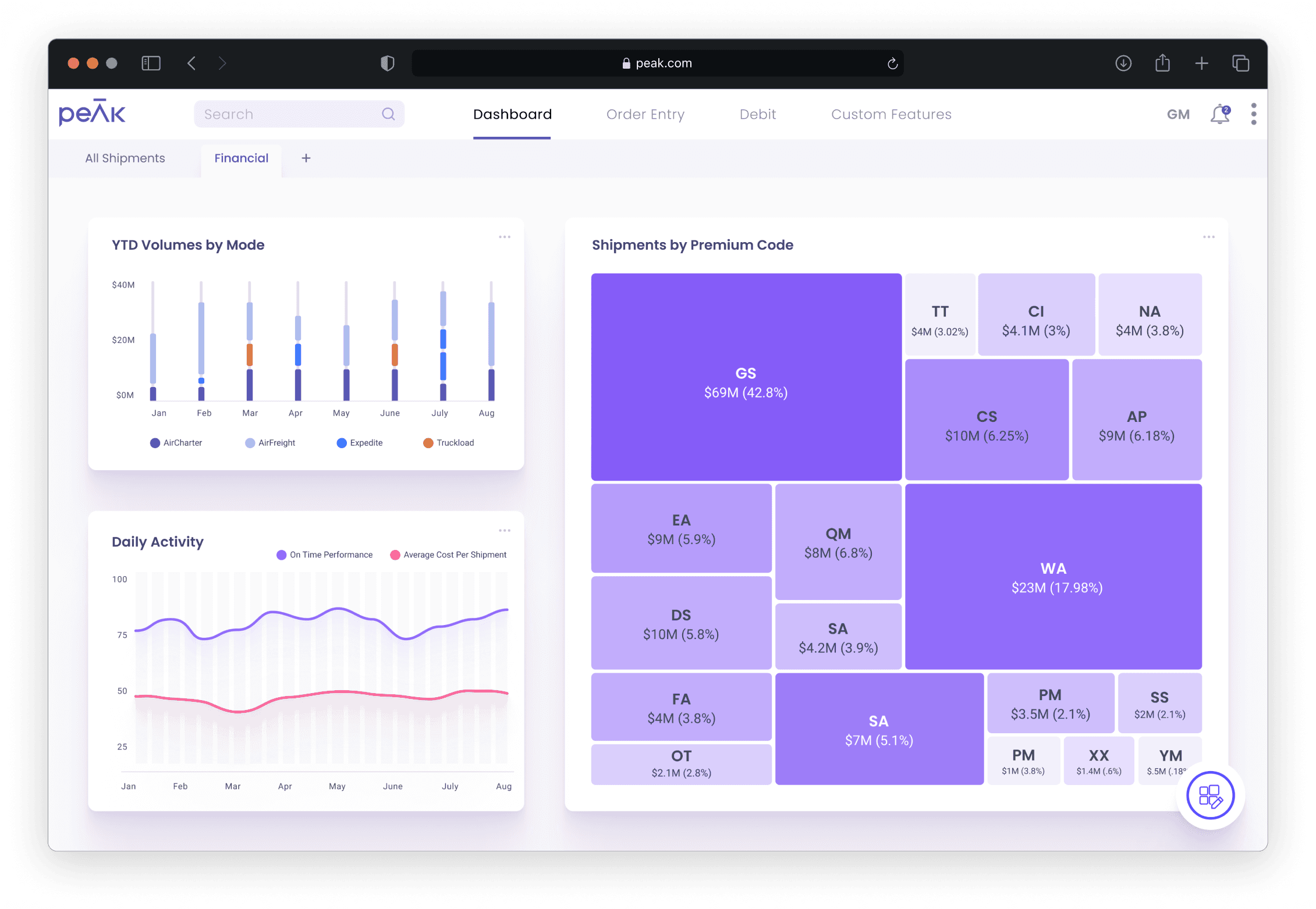
Financial View
Financial View
Financial View
Three widget customer view to manage financials
- Stacked bar chart measuring Year to Date Volumes by Mode based based on transportation modes
- Line graph measuring a comparison between On Time Performance and Average Cost Per Shipment throughout a year
- Tree map displaying Shipments by Premium Code comparing costs and percentages
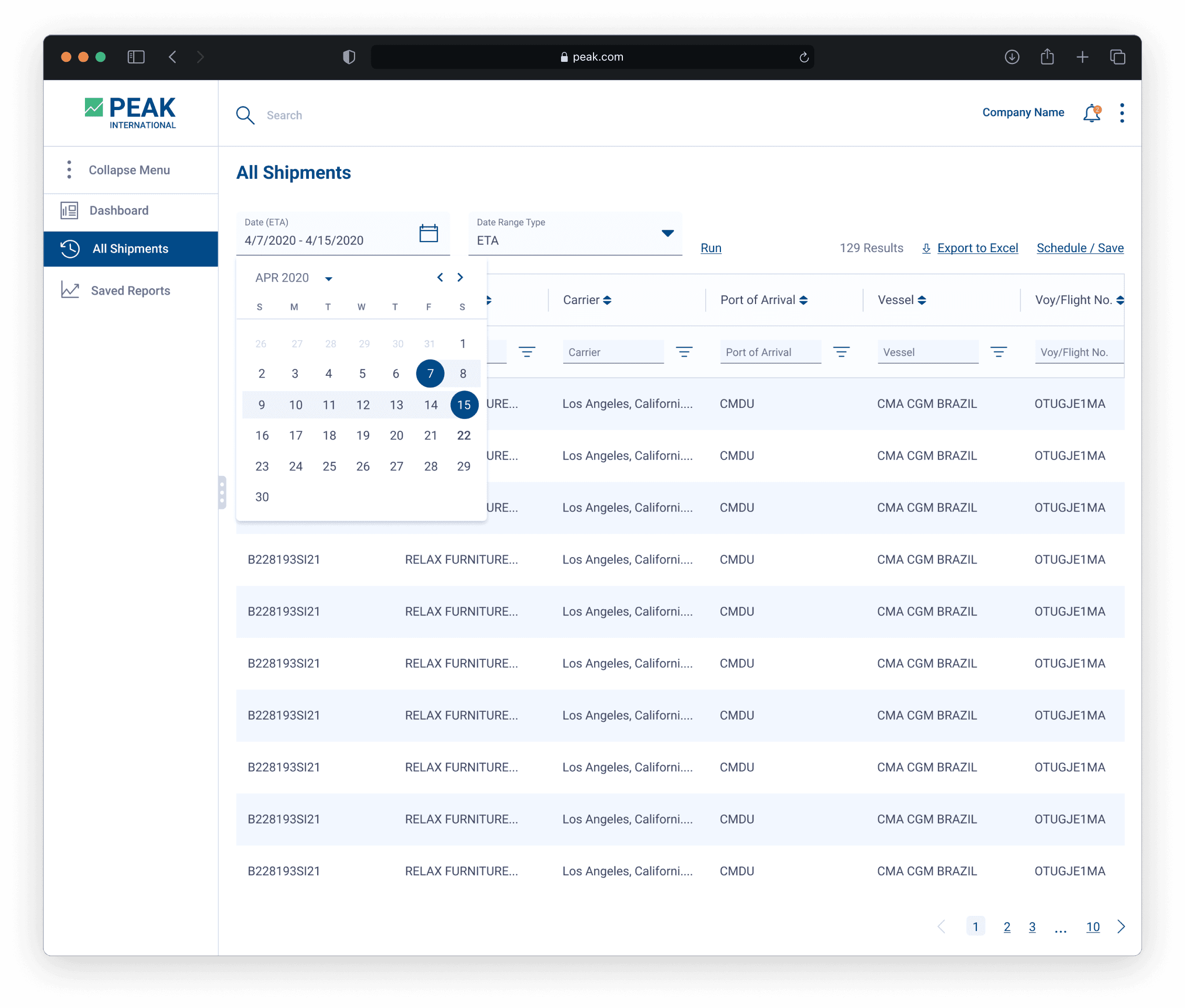
Shipment Details & All Shipments
Shipment Details & All Shipments
Shipment Details & All Shipments
The newly revamped Shipment Detail page expands on the panel pattern but utilizes a more customized view where the user can rearrange the data panels and expand their size. I wanted to mirror reuse the interactions from the dashboard and treat the panels as if they were widgets themselves. The All Shipments page uses the newly designed data table grid to house all of shipments available to the specific customer.
The newly revamped Shipment Detail page expands on the panel pattern but utilizes a more customized view where the user can rearrange the data panels and expand their size. I wanted to mirror reuse the interactions from the dashboard and treat the panels as if they were widgets themselves. The All Shipments page uses the newly designed data table grid to house all of shipments available to the specific customer.
The newly revamped Shipment Detail page expands on the panel pattern but utilizes a more customized view where the user can rearrange the data panels and expand their size. I wanted to mirror reuse the interactions from the dashboard and treat the panels as if they were widgets themselves. The All Shipments page uses the newly designed data table grid to house all of shipments available to the specific customer.
View the Prototype
View the Prototype
View the Prototype
Findings & Conclusion
Findings & Conclusion
Findings & Conclusion
During the project, we faced numerous obstacles throughout the dashboard's lifecycle. One of which was the use of user research combatting our timeline. Ascent did not conduct many user research sessions and the department was very used to working off of business requirements and developer seniority. The PEAK application has a whole was initially designed and developed by developers and did not include any sort of design thinking, let alone user research. The developers felt married to their software and took quite a bit of convincing from our end to create new solutions. Given that this was an entirely new feature, we were very adamant that we needed to conduct user research in order to find accurate user data to guide our design decisions. We were able to successfully implement a research and discovery phase into our tight timeline, to which it played a crucial role throughout the dashboard's lifecycle.
Another challenge that we faced was implementing the design system. Once I finished creating the design system, I worked with our front-end developers to properly implement it into Storybook for the developers to use. I hosted numerous workshops to assist the developers in how to properly use components and where to pull them for implementation. This process took some time for the developers to get used to but once they understood the concept, the development process became increasingly efficient.
The dashboard went through a variety of changes and is still being updated today with new widgets. Data-driven design was crucial during this project, as it guided our decision making for what types of widget ideas our users needed the most and what types of data could be used in small, digestible bits. The dashboard has also been a primary tool for our sales team to use to pitch for potential customers. It has given our users an entirely fresh experience that provides them personalization and customization while conducting their day-to-day tasks within the PEAK application.
© 2024, SCOTT KEHRES