
Ascent PEAK Design System
OVERVIEW
I was tasked to revamp and modernize Ascent’s legacy design system. After launching multiple projects using the old design system, there was an ask from leadership to begin a proper rebrand within Ascent’s technology and marketing. The prompt was simple: Make Ascent look more modern, aesthetically-pleasing, and technology-driven. The push for this rebrand and update was to attract new customers to Ascent’s services.
The previous design system relied heavily on Material Design. Most of the design system was taken directly from Material Design’s component sets. As you can see with the legacy screenshot below, the design lacks personality and flash, and overall looks incredibly dull and lifeless. We also heard from many users that it was quite “ugly” and appeared to be outdated, while compared to other supply chain software companies.
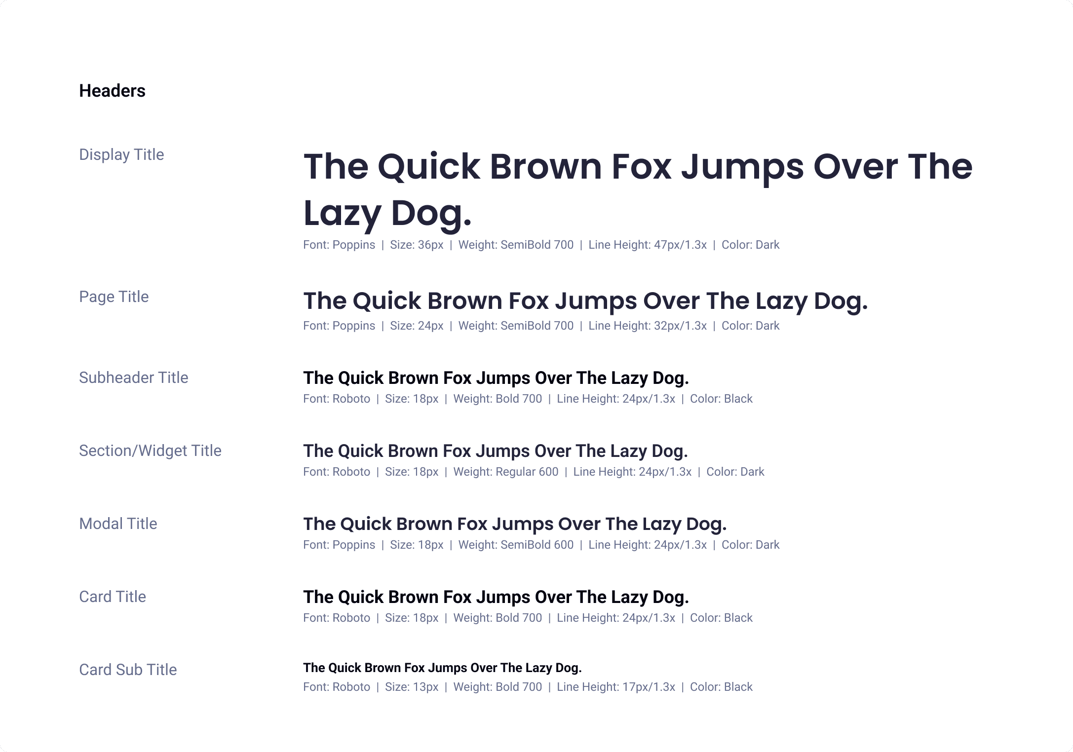
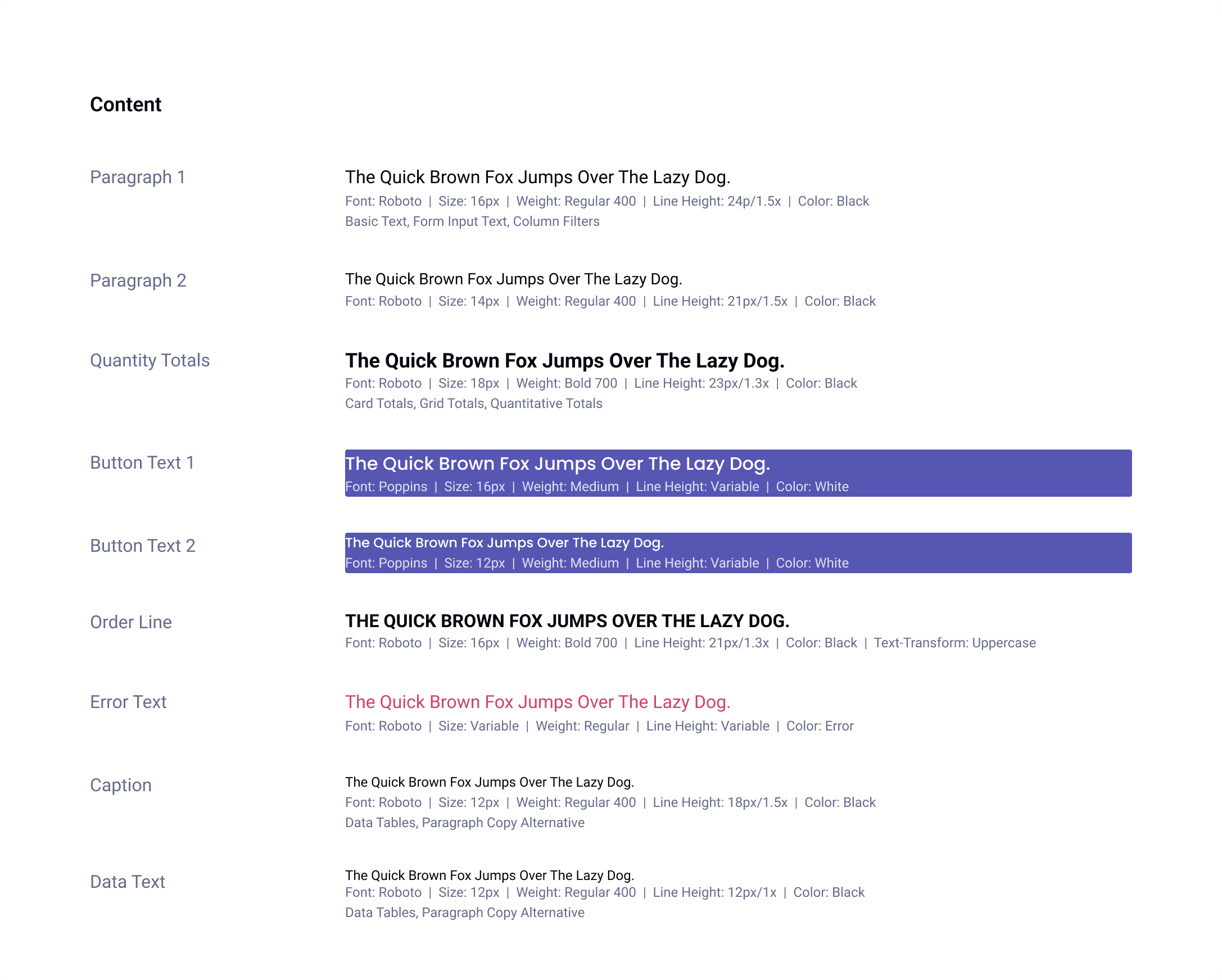
Poppins: Embracing Elegance and Clarity
With its contemporary charm and subtle sophistication, Poppins emerged as our primary typeface for headings and prominent text elements. Its clean, rounded shapes exude warmth while maintaining a distinct visual presence, ensuring that vital information stands out effortlessly.
Roboto: Nurturing Familiarity and Accessibility
Robust and adaptable, Roboto gracefully navigates the intricacies of digital interfaces, ensuring seamless legibility across varying screen sizes and resolutions. Its open counters and friendly letterforms invite users to engage effortlessly with content, fostering a sense of comfort and trust throughout their journey.


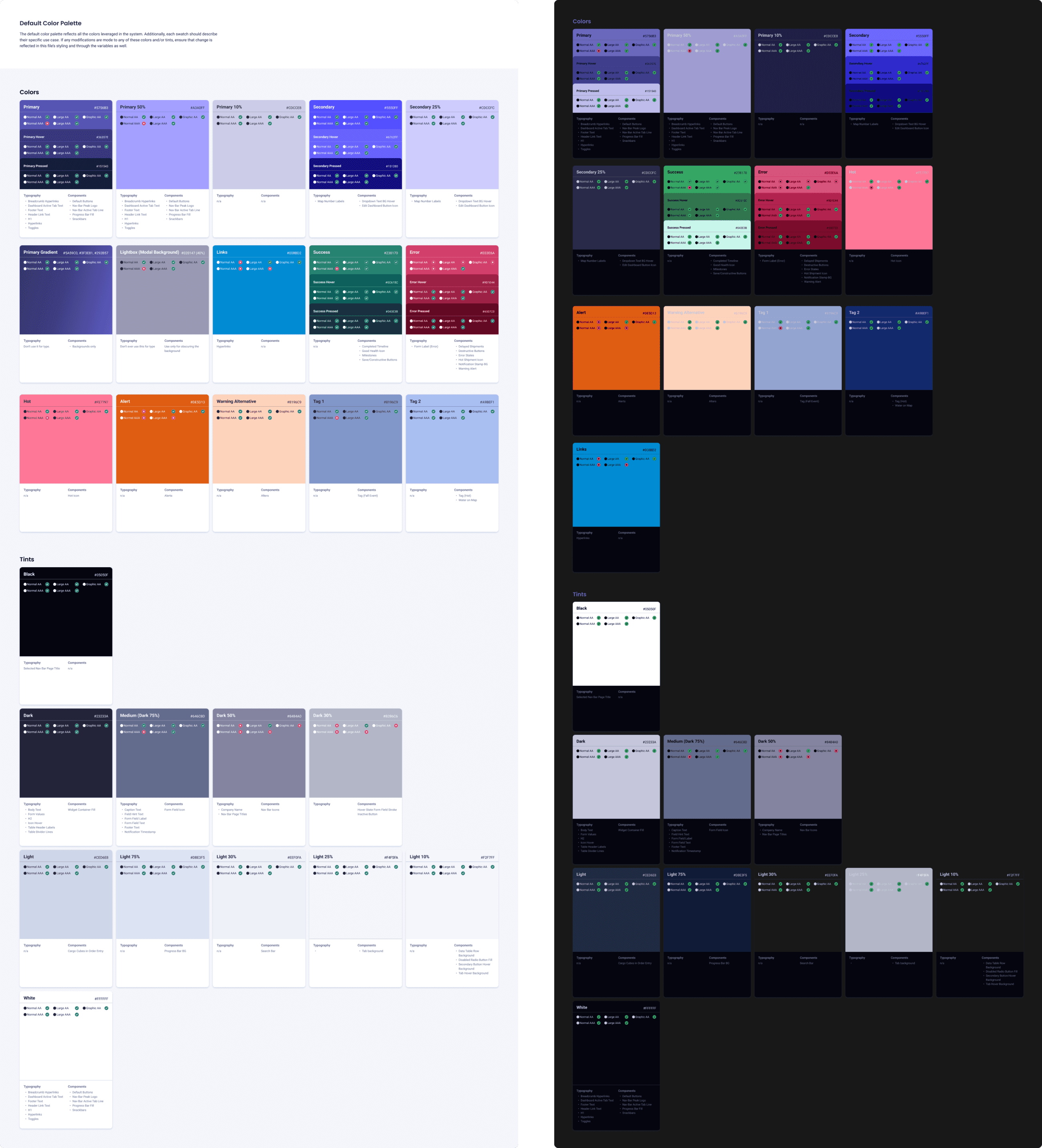
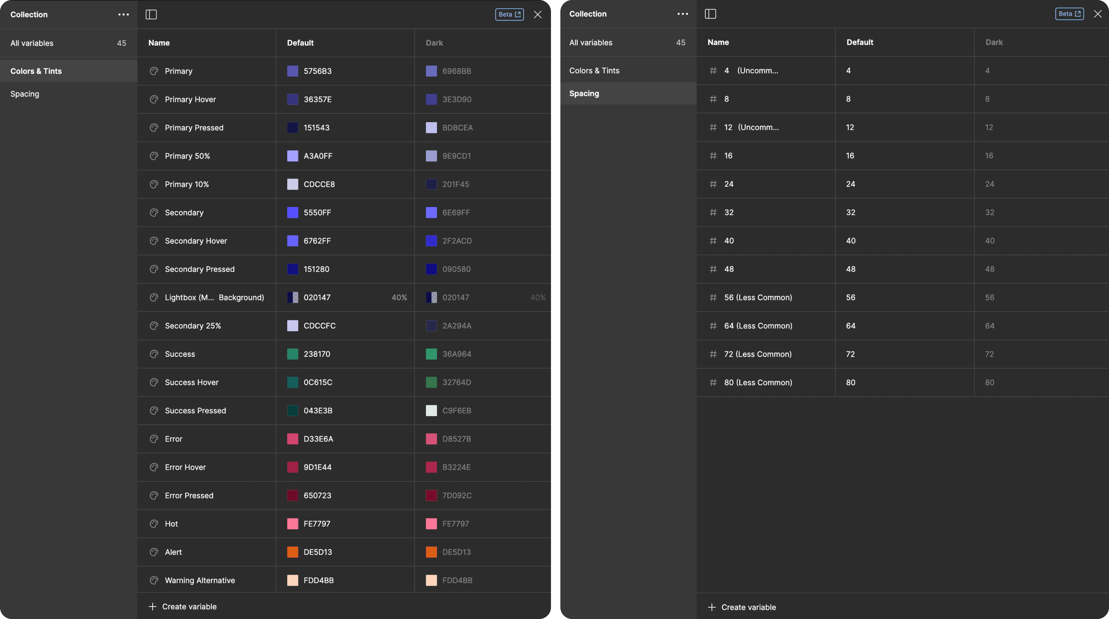
We selected colors that are crisp and clear, ensuring they meet AA and AAA accessibility standards. We designed separate color grids for both light mode and dark mode, ensuring they complement each other while maintaining appropriate contrast ratios.

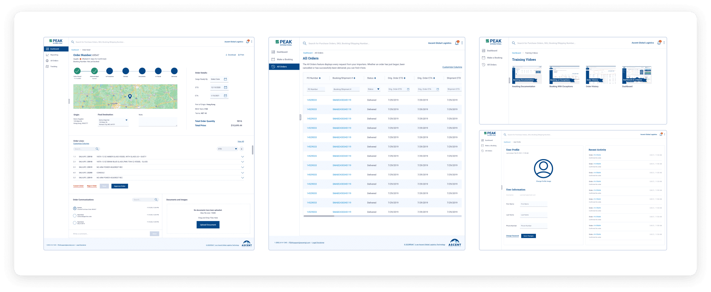
Our components represent the integration of our foundational elements, including adherence to our, spacing guidelines, typography choices, color palette, and incorporation of our unique icons. We continuously updated and refined our components to accommodate the diverse needs and use cases of designers across our product range. This ongoing process ensured that our design system remained responsive to evolving customer requirements and maintained consistency across our various products.


Variables
We made the switch from styles to variables once Figma introduced the concept at Config 2023. Our design system grew exponentially more powerful as we transferred our colors and spacing styles into variable properties.
© 2024, SCOTT KEHRES