After receiving the design brief, I immediately began talking to our customers. I decided to set up short interviews with a variety of different participants to gain a better understanding of how they used the legacy systems. I wanted to find out what they liked and disliked about their current workflows and which sections needed to be improved. The process was a combination of introducing new features, as well as fixing old ones.
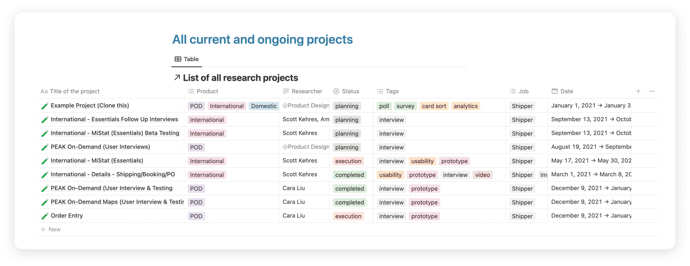
I decided to use Notion to house all of my user research. This became the standard tool moving forward with any future research our team performed with other products.
After gathering feedback from our participants, I began implementing the feedback into my designs. I first started with the three most used sections in the legacy systems: PO Details, Booking Details, Shipping Details. These three sections are the most used and highest priority items that our customers use to track and manage their shipments. We then met with each of the same participants to user test the initial designs. Each participant was scheduled for an hour usability test. I walked the participant through an interactive prototype for each of the three sections to gather their feedback.
This is an example of a participant’s notes during the interview. We color coded the feedback in terms of successfully completed tasks, questions, and unsuccessful tasks during the usability testing.
Synthesizing the Research
Synthesizing the Research
Synthesizing the Research
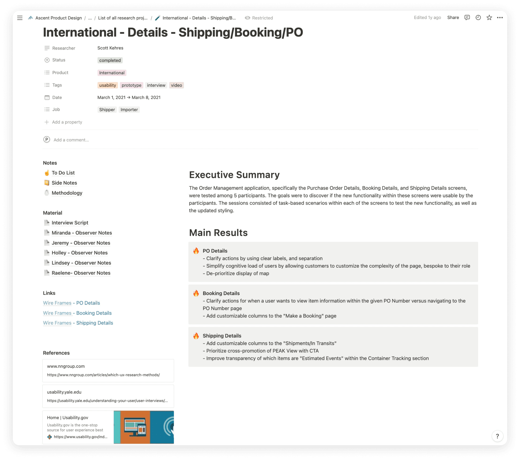
Example from our Notion file that was used to house the research for a specific section of the legacy systems. It included an executive summary, interview scripts and notes, links to the designs, design references, and main takeaways. This document was also accessible to our developers and stakeholders to assign proper takeaways and offer leadership insight into what our customers were saying.
Example from our Notion file that was used to house the research for a specific section of the legacy systems. It included an executive summary, interview scripts and notes, links to the designs, design references, and main takeaways. This document was also accessible to our developers and stakeholders to assign proper takeaways and offer leadership insight into what our customers were saying.
Example from our Notion file that was used to house the research for a specific section of the legacy systems. It included an executive summary, interview scripts and notes, links to the designs, design references, and main takeaways. This document was also accessible to our developers and stakeholders to assign proper takeaways and offer leadership insight into what our customers were saying.
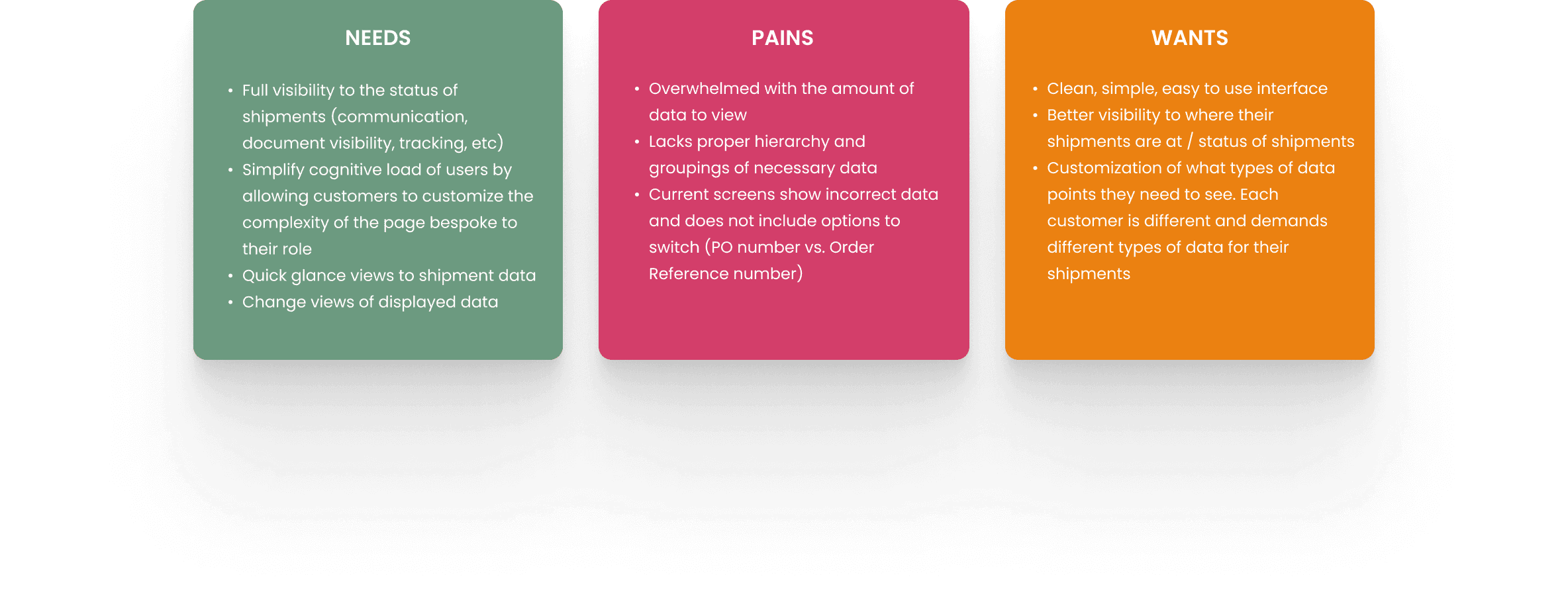
After talking with the participants, user needs, pains, and wants were formed:
After talking with the participants, user needs, pains, and wants were formed:
After talking with the participants, user needs, pains, and wants were formed:
After we found customer success with the newly designed function screens, it was then time to start creating the interactive dashboard experience. This dashboard would be the main homepage for our users. The dashboard would be widget-based and have the ability to be fully customizable based on user needs. We repeated the same research process for this feature by talking to more users, gathering feedback from what they may want to see on a dashboard, as well as aligning those ideas with business needs.
After we found customer success with the newly designed function screens, it was then time to start creating the interactive dashboard experience. This dashboard would be the main homepage for our users. The dashboard would be widget-based and have the ability to be fully customizable based on user needs. We repeated the same research process for this feature by talking to more users, gathering feedback from what they may want to see on a dashboard, as well as aligning those ideas with business needs.
After we found customer success with the newly designed function screens, it was then time to start creating the interactive dashboard experience. This dashboard would be the main homepage for our users. The dashboard would be widget-based and have the ability to be fully customizable based on user needs. We repeated the same research process for this feature by talking to more users, gathering feedback from what they may want to see on a dashboard, as well as aligning those ideas with business needs.
Analyzing the Feedback into Dashboard Widget Solutions
Analyzing the Feedback into Dashboard Widget Solutions
Analyzing the Feedback into Dashboard Widget Solutions
We found that the majority of users needed the following information for their widgets:
We found that the majority of users needed the following information for their widgets:
We found that the majority of users needed the following information for their widgets:
Interactive Map - Show locations of where shipments are located, inbound and outbound groupings, live tracking of where shipments are moving
Shipments by Delivery Address - Show breakdown of shipments based on address locations. Use a proper data visualization to convey this information. Breakdowns should be based on a custom date range inputted by the user
Updates & Holds - Visibility to any late shipments that may occur. Link shipment IDs and show updated ETA times
Ascent Blog - Populate widget with most recent Ascent blog content and articles. Users found this helpful in keeping them in the loop of any supply chain-related updates
Shipment Groups - The most important widget. This widget will organize each incoming shipment while showing their progress, destinations, ETDs, ETAs, order reference numbers, and transportation types. The views should be filterable by a variety of properties such as In Transit, Pre Transit, Delivered, ISF, etc.
After wireframing out the architecture, I began to implement the PEAK design system. I also designed a variety of new components specific to Order Entry, such as the new vertical stepper and success state animations to make the tool more lively.
After wireframing out the architecture, I began to implement the PEAK design system. I also designed a variety of new components specific to Order Entry, such as the new vertical stepper and success state animations to make the tool more lively.
After wireframing out the architecture, I began to implement the PEAK design system. I also designed a variety of new components specific to Order Entry, such as the new vertical stepper and success state animations to make the tool more lively.
Design (PEAK 3.0 Design System)
Design (PEAK 3.0 Design System)
Design (PEAK 3.0 Design System)
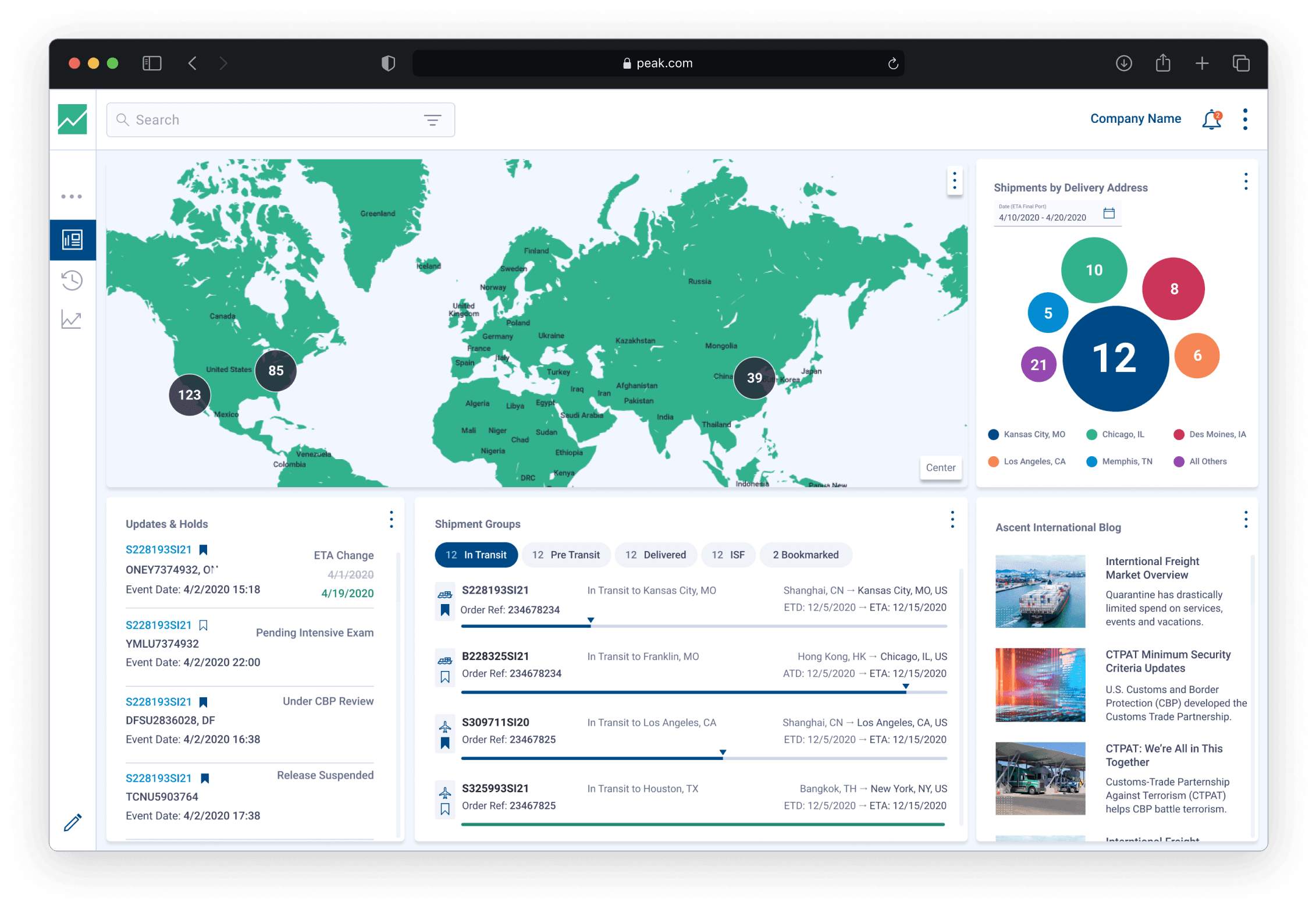
The following screens are the first pass of the PEAK dashboard that includes the user feedback. Each widget is fully customizable in terms of its data. This was designed with the legacy PEAK 3.0 design system.
The following screens are the first pass of the PEAK dashboard that includes the user feedback. Each widget is fully customizable in terms of its data. This was designed with the legacy PEAK 3.0 design system.
The following screens are the first pass of the PEAK dashboard that includes the user feedback. Each widget is fully customizable in terms of its data. This was designed with the legacy PEAK 3.0 design system.
Fully Populated Dashboard
Fully Populated Dashboard
Fully Populated Dashboard
PEAK fully populated dashboard including the 5 previously stated widgets
PEAK fully populated dashboard including the 5 previously stated widgets
PEAK fully populated dashboard including the 5 previously stated widgets
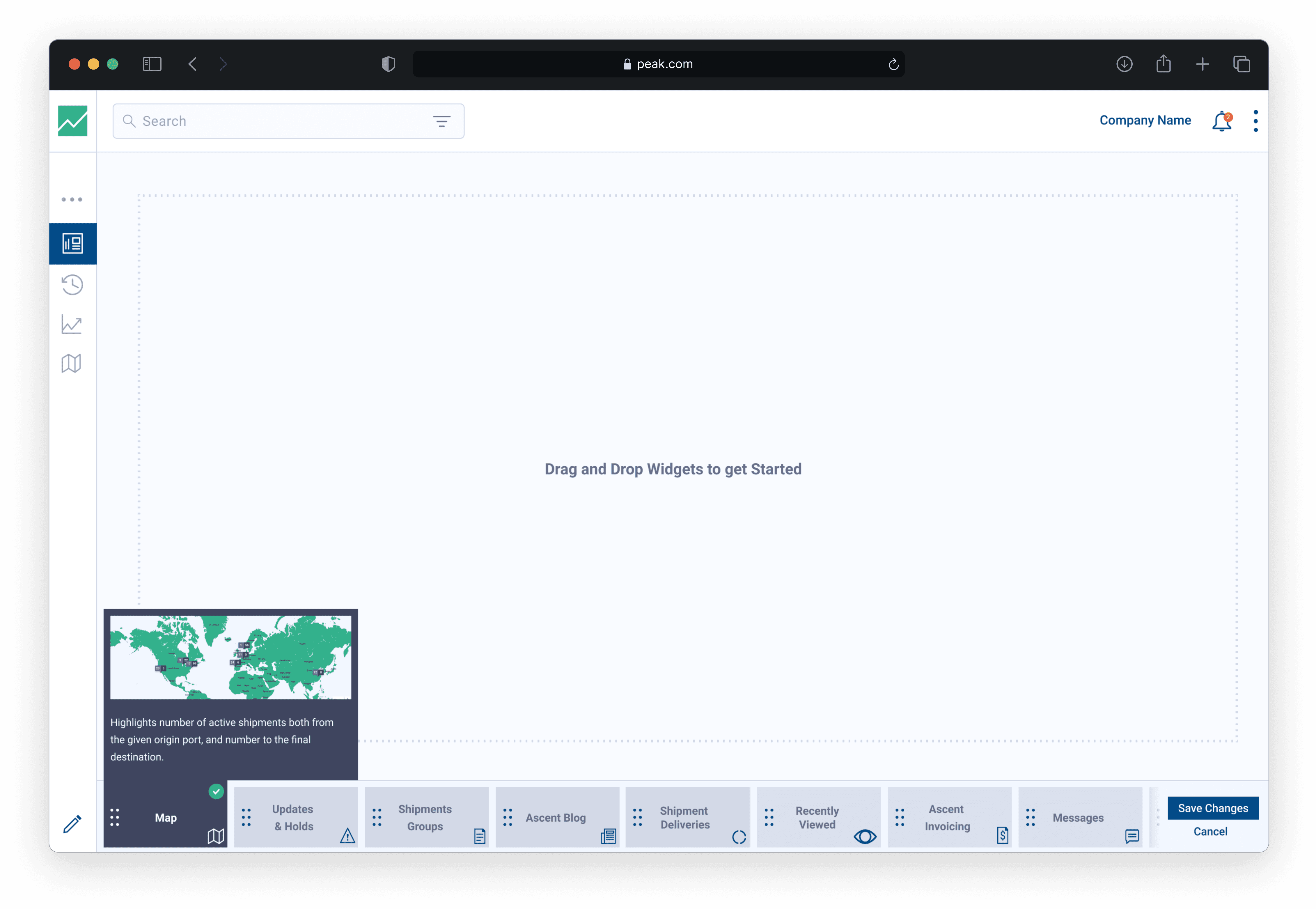
Moving, Resizing & Deleting Widgets
Moving, Resizing & Deleting Widgets
Moving, Resizing & Deleting Widgets
Each widget can be resized, moved, or deleted. We built this framework using the jQuery plugin, Gridster
Each widget can be resized, moved, or deleted. We built this framework using the jQuery plugin, Gridster
Each widget can be resized, moved, or deleted. We built this framework using the jQuery plugin, Gridster
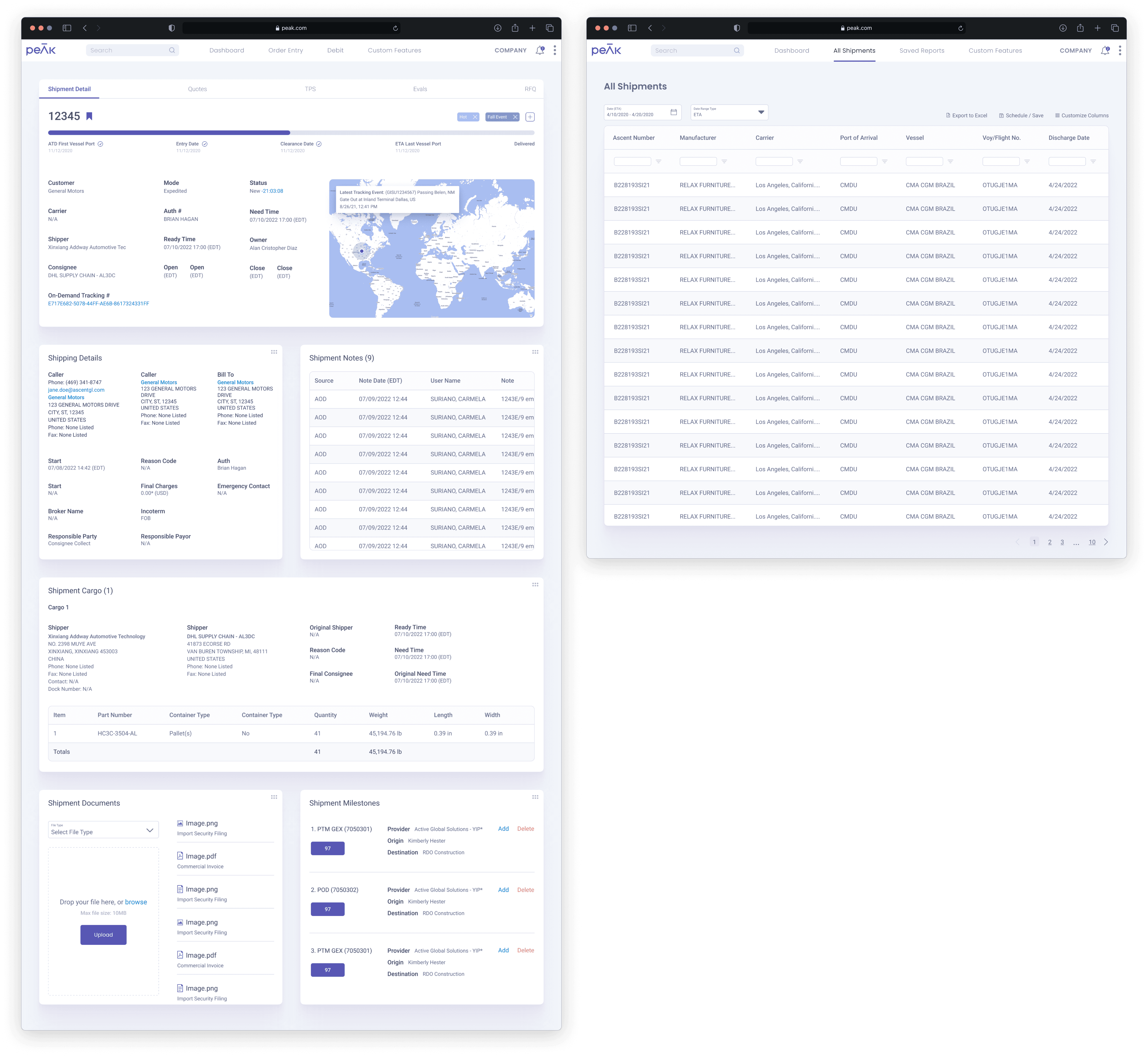
Example of a Shipment Detail page, which houses all of the unique data and tracking for an individual shipment. Each of the main data points are housed in expansion panels including the main shipment details, commercial invoices, container information, container tracking, communication services, and a spot to host documents and images.
Example of a Shipment Detail page, which houses all of the unique data and tracking for an individual shipment. Each of the main data points are housed in expansion panels including the main shipment details, commercial invoices, container information, container tracking, communication services, and a spot to host documents and images.
Example of a Shipment Detail page, which houses all of the unique data and tracking for an individual shipment. Each of the main data points are housed in expansion panels including the main shipment details, commercial invoices, container information, container tracking, communication services, and a spot to host documents and images.
Once I finished creating and testing the new design system, as well as receiving approval after presenting the new concepts to leadership and our customers, it was time to implement the new system and reskin the PEAK 3.0 screens.
Once I finished creating and testing the new design system, as well as receiving approval after presenting the new concepts to leadership and our customers, it was time to implement the new system and reskin the PEAK 3.0 screens.
Once I finished creating and testing the new design system, as well as receiving approval after presenting the new concepts to leadership and our customers, it was time to implement the new system and reskin the PEAK 3.0 screens.
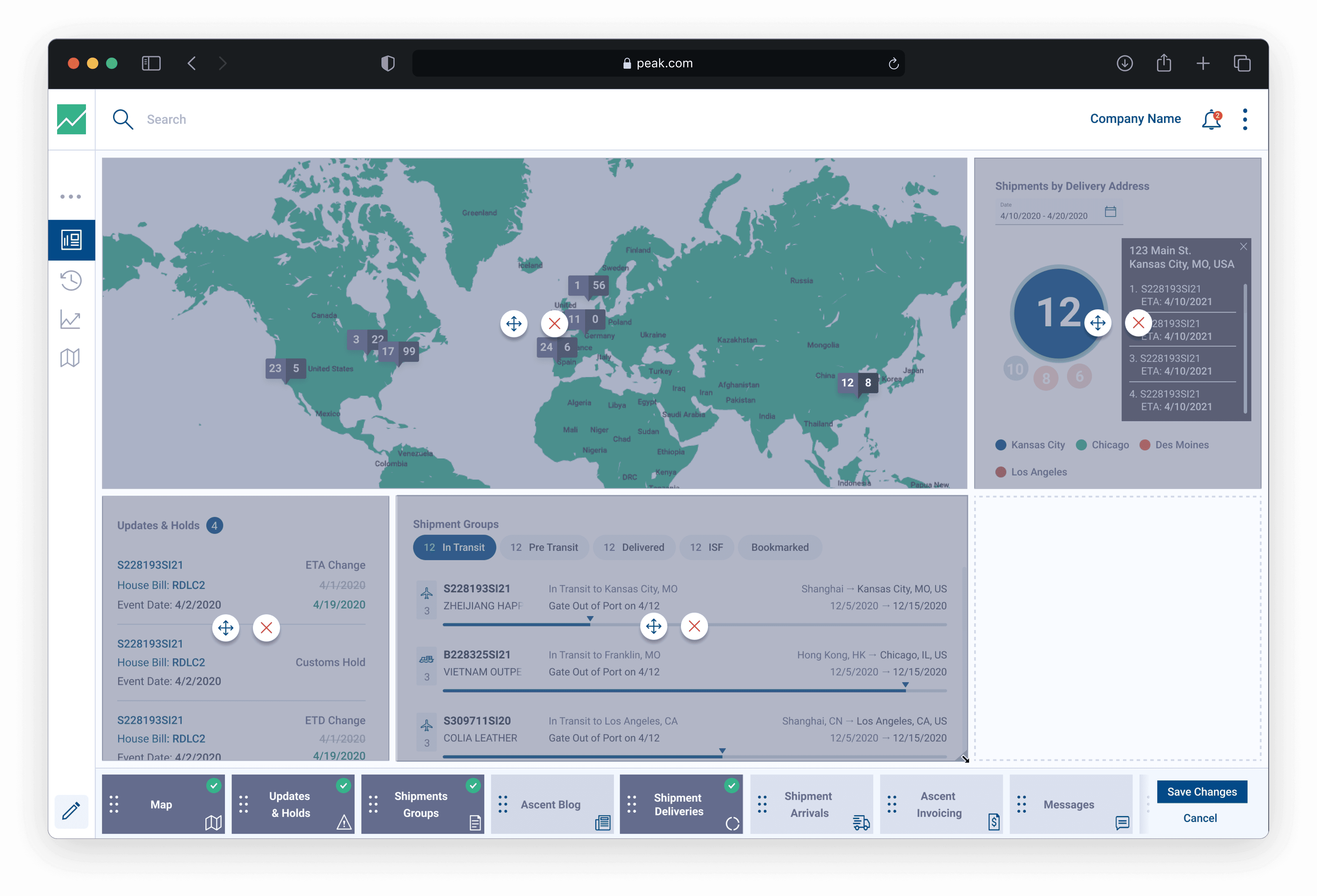
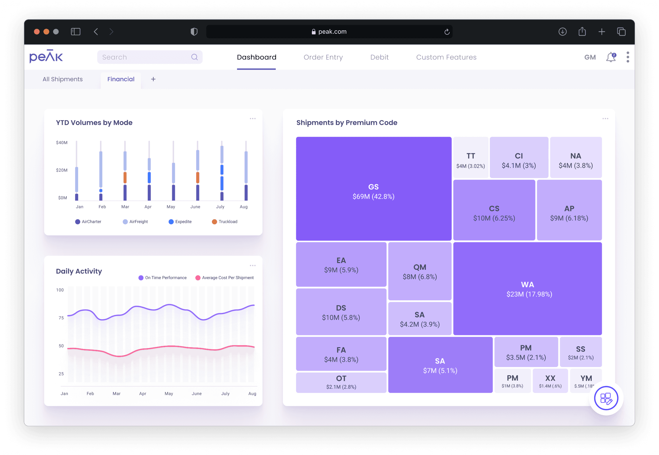
Dashboard - Shipment Groups & Map
Dashboard - Shipment Groups & Map
Dashboard - Shipment Groups & Map
Refreshed dashboard using the PEAK 4.0 design system. This view contains the new Shipment Groups widget on the left and the new map widget on the right. I wanted to introduce 3D elements to the design system with a fully interactive, spinning globe model. The globe can be toggled between a 2D and 3D view. This view also displays the open widget drawer.
Refreshed dashboard using the PEAK 4.0 design system. This view contains the new Shipment Groups widget on the left and the new map widget on the right. I wanted to introduce 3D elements to the design system with a fully interactive, spinning globe model. The globe can be toggled between a 2D and 3D view. This view also displays the open widget drawer.
Refreshed dashboard using the PEAK 4.0 design system. This view contains the new Shipment Groups widget on the left and the new map widget on the right. I wanted to introduce 3D elements to the design system with a fully interactive, spinning globe model. The globe can be toggled between a 2D and 3D view. This view also displays the open widget drawer.
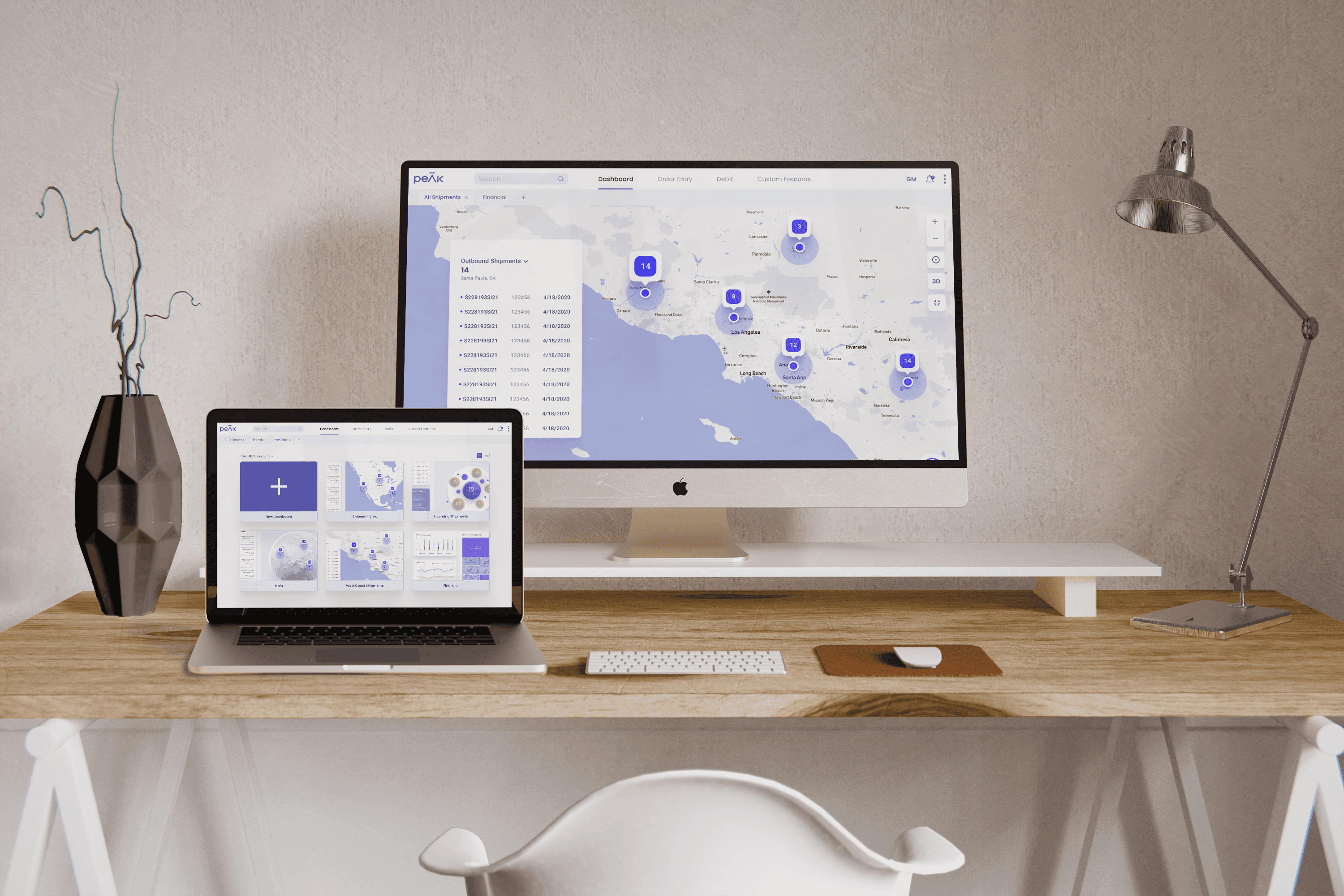
The user has the ability to extend the widgets to a full screen view for better visibility. This is the 2D view with a highlighted pin showing the outbound shipments within Santa Paula, CA.
The user has the ability to extend the widgets to a full screen view for better visibility. This is the 2D view with a highlighted pin showing the outbound shipments within Santa Paula, CA.
The user has the ability to extend the widgets to a full screen view for better visibility. This is the 2D view with a highlighted pin showing the outbound shipments within Santa Paula, CA.
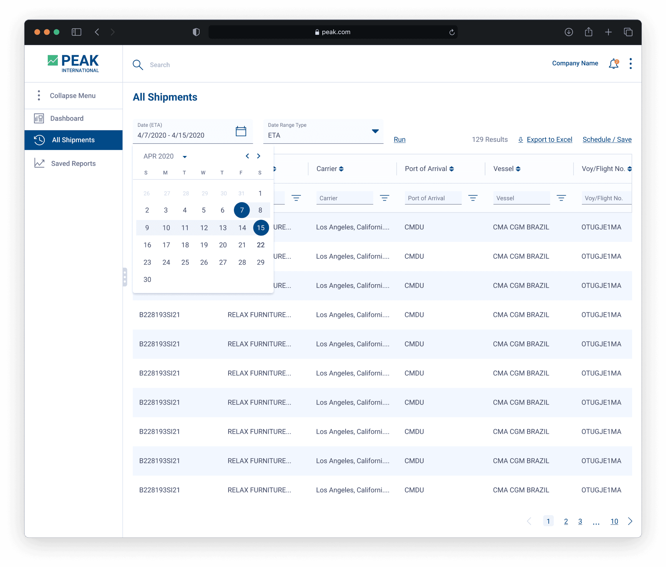
Shipment Details & All Shipments
Shipment Details & All Shipments
Shipment Details & All Shipments
The newly revamped Shipment Detail page expands on the panel pattern but utilizes a more customized view where the user can rearrange the data panels and expand their size. I wanted to mirror reuse the interactions from the dashboard and treat the panels as if they were widgets themselves. The All Shipments page uses the newly designed data table grid to house all of shipments available to the specific customer.
The newly revamped Shipment Detail page expands on the panel pattern but utilizes a more customized view where the user can rearrange the data panels and expand their size. I wanted to mirror reuse the interactions from the dashboard and treat the panels as if they were widgets themselves. The All Shipments page uses the newly designed data table grid to house all of shipments available to the specific customer.
The newly revamped Shipment Detail page expands on the panel pattern but utilizes a more customized view where the user can rearrange the data panels and expand their size. I wanted to mirror reuse the interactions from the dashboard and treat the panels as if they were widgets themselves. The All Shipments page uses the newly designed data table grid to house all of shipments available to the specific customer.